What makes an Amazon listing that actually converts?
More traffic won't save a listing that doesn't convert. Here's what actually turns Amazon clicks into orders — main image, title, bullets, A+, reviews and price.
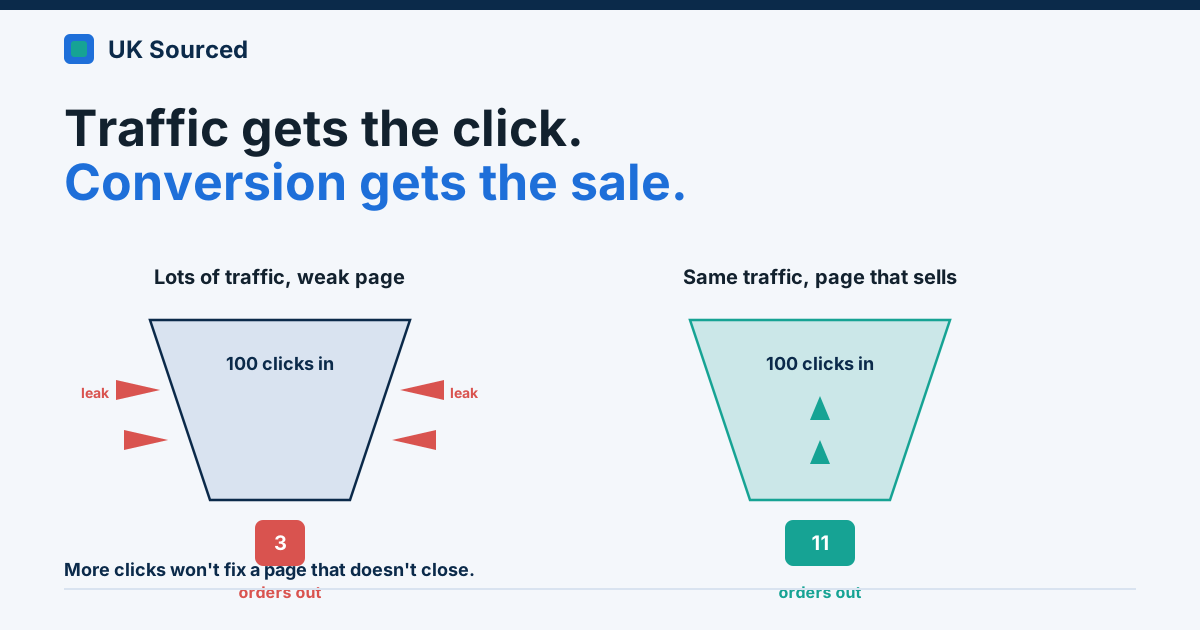
A seller emailed us last month, frustrated. He'd doubled his ad budget, his sessions were up nicely, and his sales had barely moved. "I'm getting the traffic," he said, "so why aren't they buying?" We looked at his listing for about ninety seconds and had the answer. His main image had a logo slapped in the corner, his first bullet led with the material composition, and he had eleven reviews sitting at 3.9 stars.
Traffic wasn't his problem. Conversion was.
This is the thing nobody tells you when you start out. Everyone obsesses over ranking and ads — getting seen. But a shopper on Amazon decides in seconds, and if your page doesn't do the persuading, all that lovely traffic just flows straight past. You're paying for clicks and handing them to a competitor whose page closes the sale.
So let's talk about what actually makes people buy. Not theory. The bits we check first, in the order they matter, when a client's conversion rate is limping.
The main image does most of the work
Here's an uncomfortable truth: your main image is probably the single biggest lever on your whole listing. It's the first thing a shopper sees in search, before they've read a word. If it doesn't earn the click, nothing else you've written gets a chance.
Amazon's own rules are strict here, and for once they're on your side. Pure white background. Product fills most of the frame. No text, no logos, no badges, no "best seller" starbursts crowbarred into the corner. We see that mistake constantly — someone thinks a splash of marketing on the main image helps, when all it does is make the product look smaller and risk suppression.
Get the product big, sharp, well-lit and obviously the thing. That's the job. Save the lifestyle shots, the infographics and the size comparisons for images two through seven — that's exactly what they're for.
Your title is a hook, not a keyword dump
Titles are where good intentions go to die. Sellers cram every keyword they can think of in, produce something 200 characters long that reads like a ransom note, and wonder why it doesn't land.
A title has two jobs at once. It needs the main keyword near the front so Amazon knows what you are, and it needs to make sense to a human skim-reading a wall of results. Brand, then what the thing is, then the one or two attributes that matter most — size, count, key feature. That's usually enough.
Watch your length, too. Overstuff a title past Amazon's formatting limits and the listing can get suppressed outright, which means it vanishes from search results entirely. (We've got a whole other post on suppression — it's a nasty one to walk into blind.) Clarity beats cleverness every time here.
Bullets that sell the benefit, not the spec sheet
Now the part that separates a listing that converts from one that just informs.
Most bullets are written from the seller's side of the table. "Made from 304 stainless steel." "500ml capacity." "BPA-free construction." All true, all useless on their own, because the shopper doesn't care about the spec — they care about what it does for them.
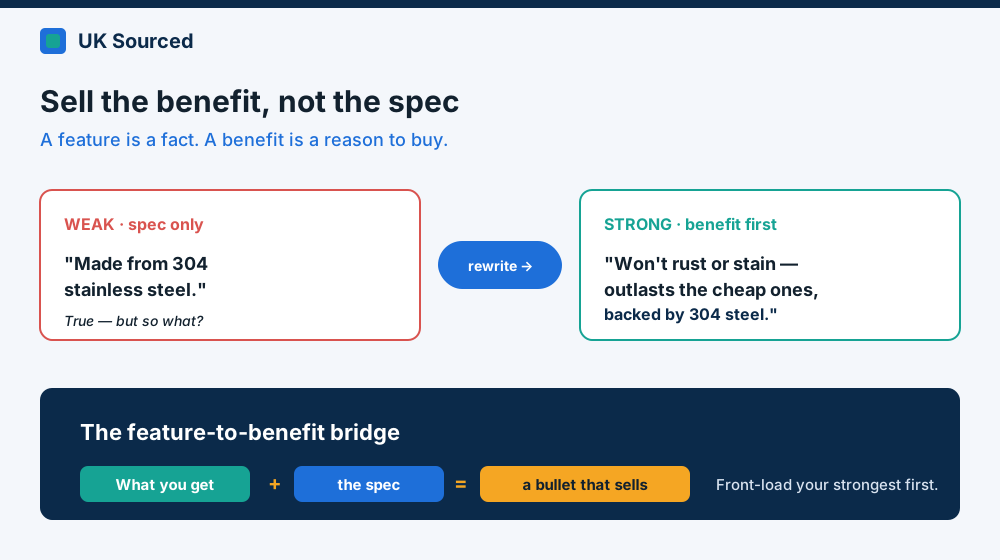 Lead with what the shopper gets, then back it with the spec. Feature alone is a fact; benefit is a reason to buy.
Flip it round. "304 stainless steel" becomes "won't rust, stain or hold onto yesterday's coffee — built to outlast the cheap ones." "500ml capacity" becomes "holds a proper full mug, so you're not refilling every ten minutes." Same fact, but now it's answering the only question the shopper's actually asking: what's in it for me?
Lead each bullet with the benefit in a couple of bold words, then justify it with the spec. Front-load the ones that matter. Nobody reads all five properly, so put your strongest argument first and don't waste the top slot on warranty small print.
A+ Content: use the space, don't just fill it
If you're Brand Registered — and if you own a brand and you're not, sort that out — you get A+ Content. This is the enhanced section further down the page with proper images, comparison tables and formatted text, in place of the plain paragraph you'd otherwise get.
Two reasons it earns its keep. It genuinely lifts conversion, because it lets you show rather than tell — a comparison chart against your own range, a lifestyle image that puts the product in context, an FAQ that heads off the doubts. And it's prime real estate for building trust in a brand people have never heard of.
The mistake we see is treating A+ as decoration. Pretty banners, a stock photo, a line of brand waffle, no actual argument. Waste. Use one module to compare your options so people buy the right one instead of bouncing. Use another to answer the question that makes them hesitate. Every module should be doing a job.
Reviews and price: the trust that closes it
You can nail every one of the above and still lose the sale at the last second, because two things do the final closing — and they're the two you control least directly.
Reviews. Social proof is enormous on Amazon. A shopper choosing between your product and a near-identical rival will pick the one with more reviews and a better star rating, nearly every time, almost without thinking. Getting from zero to your first chunk of reviews is the hardest yard in a launch — enrol in Amazon's Vine programme early, make sure your product genuinely delivers, and never, ever buy fake ones. Amazon's very good at spotting them now, and the penalty is worse than the slow honest route.
Price and offer. Price doesn't have to be lowest, but it has to make sense next to the alternatives on the page. If you're 40% dearer than a comparable rival with more reviews, no bullet on earth rescues that. A well-timed coupon or a clear multi-buy can tip a hesitating shopper over the line — that little green flash of a saving does real work.
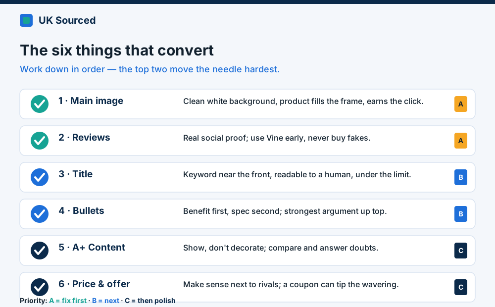 Work down the list in order. Fix the main image and reviews first — they move the needle hardest.
The misses we see again and again
A few patterns turn up so often they're worth calling out plainly:
- All traffic, no conversion focus. Throwing ad spend at a page that doesn't convert. You're just paying more to lose people. Fix the page first, then scale the ads.
- Mobile ignored. Most Amazon shopping happens on a phone now. If your bullets are a wall of text and your images need pinch-zooming to read, you're losing the majority of your audience. Check every listing on your own phone.
- Written for the algorithm, not the human. Keyword-stuffed titles and bullets that read like a robot wrote them. Amazon's smart enough now; write for the person, place the keywords naturally, and you get both.
- Set and forgotten. A listing isn't a one-off task. Reviews land, rivals shift, seasons turn. The good ones get revisited.
None of this is complicated. It's just fiddly, and it's the kind of thing that slips down the list when you're busy running the actual business. If your traffic's fine but the sales aren't following — that's almost always a conversion problem hiding in plain sight, and it's exactly the sort of thing we pull apart for clients. Fancy a second pair of eyes on yours? Drop us a line at enquiries@uksourcedltd.com.